
Shining a Light on the Next Generation of Designers | Red x Arts University Plymouth
Discover Red’s new EVO Pro Change Robe collaboration with Arts University Plymouth students – spotlighting young design talent and creativity.


Written by Lydia Burdett /
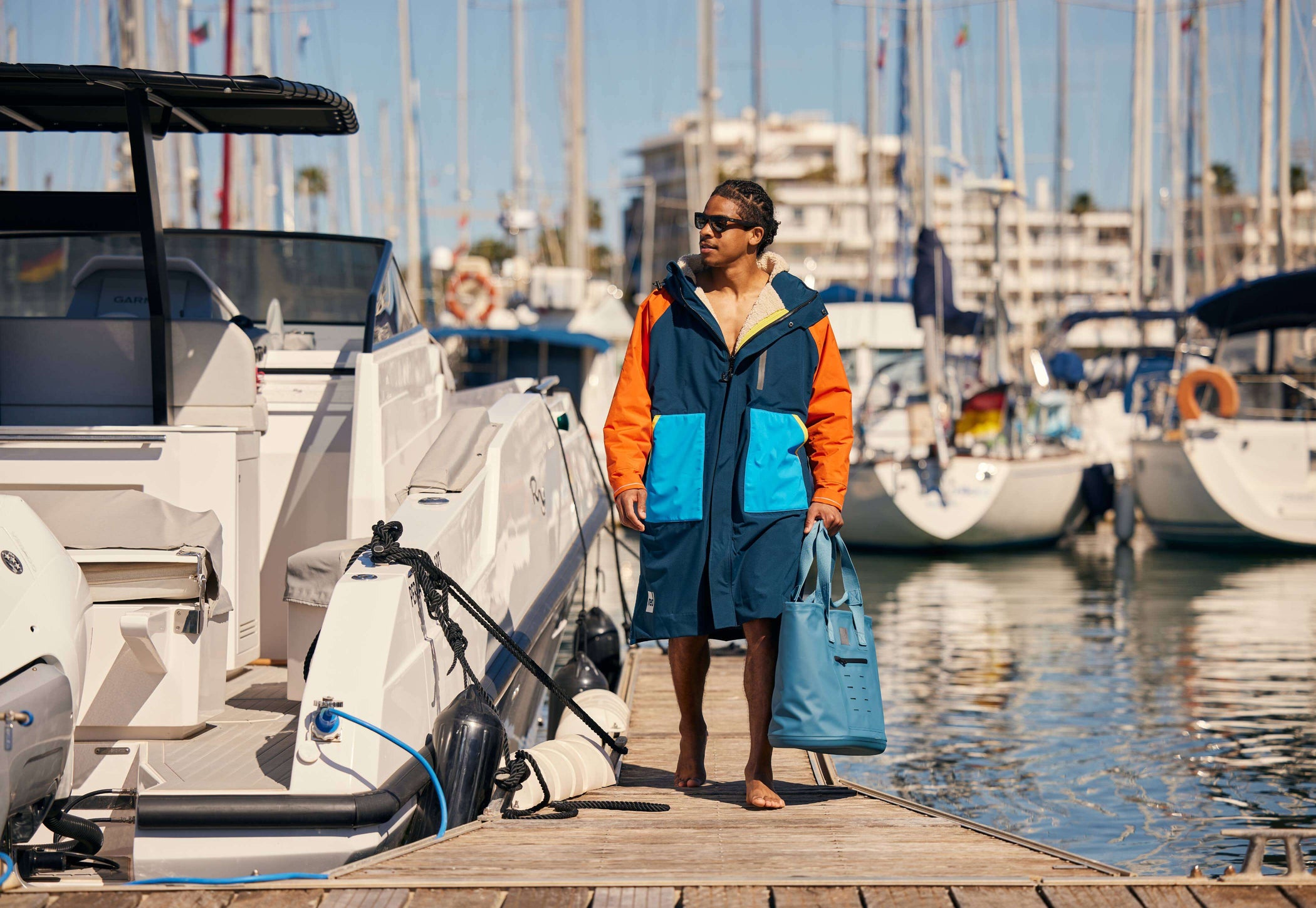
For Cornwall-based designer Kelsey Vanderplank, the sea has always been more than a backdrop – it’s a constant source of inspiration. Recently graduated from Arts University Plymouth with a degree in Textile Design, Kelsey has already seen her work come to life. Her ocean-inspired print was selected to become a limited-edition design for Red Equipment, a collaboration that brought her university project into the hands of a global outdoor brand. Read on as Kelsey shares her journey, creative process, and how it felt to see her design transformed from sketchbook pages into a fully realised product…
I’ve always been a creative person, even from a young age. I loved art at school, but I didn’t fully realise my passion for textiles and pattern design until I started my degree at Arts University Plymouth. Studying Textile Design gave me the space to experiment, explore different techniques and materials, and discover how much I enjoy creating patterns that can live on physical products.
Design has always felt natural to me. As a kid, I was constantly drawing or making things, but at university I really found my direction. I discovered how much I love pattern design, sewing, and translating little visual details into something expressive. It showed me how creativity can be both personal and practical – something you can wear, use, or experience.


Honestly, I was shocked – in the best possible way. I couldn’t quite believe my design had been chosen. Once it sank in, I was so excited. The idea of seeing my artwork on a real product, and one made by a global brand like Red, felt surreal. It’s one thing to design something on a screen, but quite another to know it will be out in the world.
My biggest inspiration will always be the beach. Growing up in Cornwall meant the coastline was a huge part of my everyday life. When I started this project, I knew immediately that I wanted to work with textures, shapes, and patterns from the sea – the reflections, the ripples, the tiny details you only notice when you stop and look closely. My design is my way of sharing that connection.


I started by going down to my local beach, sketching and taking photos of the water and its textures. Back in the studio, I layered those sketches and images together in Photoshop, experimenting with patterns, repetition, and composition. Because Red is all about outdoor adventure and connection to nature, it made sense for my design to feel organic, energetic, and rooted in real places that mean something to me.
The brief encouraged us to consider Red’s existing colour palette, so I spent time studying what they already use. I wanted my design to fit their brand but still feel like me. That’s where the hot pink came in – it adds personality and vibrancy without clashing with Red’s aesthetic. It’s the colour that gives the design its punch and reflects my own creative flair.


One of the biggest challenges was visualising how the pattern would sit on a real product. Designing something flat is completely different from imagining it wrapped around a robe or other pieces of kit. Working with tutors and the team at Red helped me adjust scale, play with placement, and choose colours that would work on fabric rather than paper or screen.
Once I saw how the pattern worked at different scales, it became exciting rather than intimidating. Testing colours, adjusting the repeat, and seeing it mocked up on the robe helped me understand how patterns behave in the real world. By the end, I felt confident that the design formed naturally with the product.


The Red team were genuinely lovely – supportive, welcoming, and really invested in my development as a designer. They walked me through the details that go into product design, from zips to trims to fabric choices, and helped me understand how all of those elements interact with a pattern. It was a proper creative partnership.
Definitely. I didn’t realise how many layers there are to designing a product. Every detail – the hardware, the type of stitching, the lining, the sustainability considerations –influences the final outcome. Seeing how Red thinks about durability and responsible production gave me a new appreciation for the design process as a whole.
I hope people feel a little more connected to the coast. My design captures tiny abstract details from the water that most people walk past without noticing. If someone wearing the robe feels reminded of the beach, or sees something new in the pattern every time they look at it, then that means a lot to me.


It felt incredible. Seeing my design printed on fabric – especially with the hot pink standing out – was such a special moment. Until then, it had only ever existed on paper or my laptop. Holding the final product made everything feel real and showed me what’s possible for my future work.
When you start university, collaborating with big brands doesn’t always seem like something that can happen. I hope my experience shows that these opportunities do exist and that students should say yes to anything that helps them grow. You never know where one project might lead.


Right now, I’m building my portfolio and continuing to develop my pattern design skills. I’m open to any creative opportunities that come my way, and I’m excited to see where this path takes me.
This project confirmed that I genuinely love fashion and textile design, especially when my patterns can live on real, wearable products. I’d love to continue down that path and see how far I can push my ideas in the fashion and outdoor worlds.

Inspired by the shifting patterns of the Cornish coastline, Tidal Textures brings Kelsey Vanderplank’s ocean-driven artwork to our most advanced change robe. Organic, energetic, and rooted in real seaside moments, this exclusive print celebrates creativity, connection to the water, and the freedom to explore.
Discover Red’s new EVO Pro Change Robe collaboration with Arts University Plymouth students – spotlighting young design talent and creativity.

Discover how Red Equipment champions sustainability through recycled materials, thoughtful design, and durable products made to reduce environmental impact.
Find out more about Red’s new Recovered Collection - Conscious but technologically advanced changing robes made responsibly from surplus fabric.

Discover the inspiration & design process behind our innovative 3-in-1 waterproof parka jacket, as we sit down with the talented designer, Cat Heraty.

Cast your mind back to summer last year and you might recall a slightly unusual competition we ran that was searching for a creative soul to design a new look...
Spend £50 more for free delivery
Your bag is currently empty.
Creating an account has many benefits. Get exclusive access to rewards and perks for members only.
